Design Studio Tab
Use the Design Studio tab to style your Turnstile widget in one place — theme, size, alignment, background, border, shadow, and labels. Every change shows instantly in the live preview, so you can match your store's look without writing CSS.
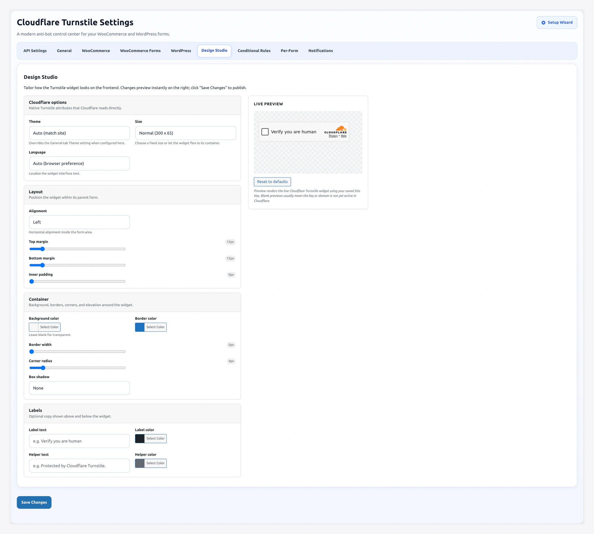
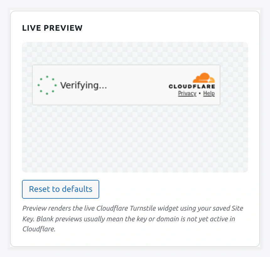
Live preview renders a real Cloudflare Turnstile widget using your saved Site Key — every change reflects instantly:
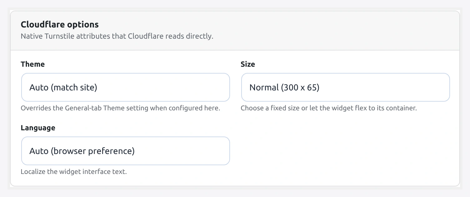
Cloudflare section — theme, size, language:
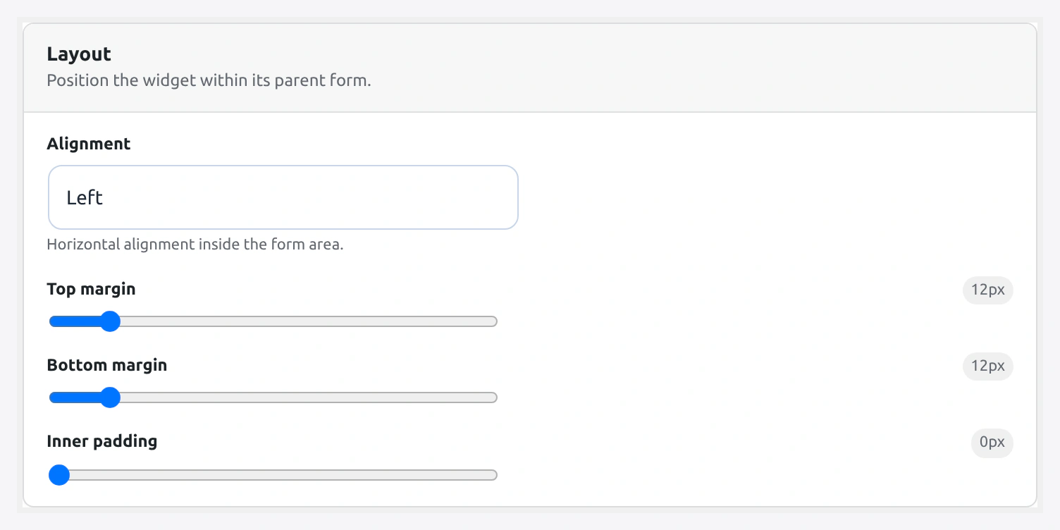
Layout section — alignment, margins, padding:
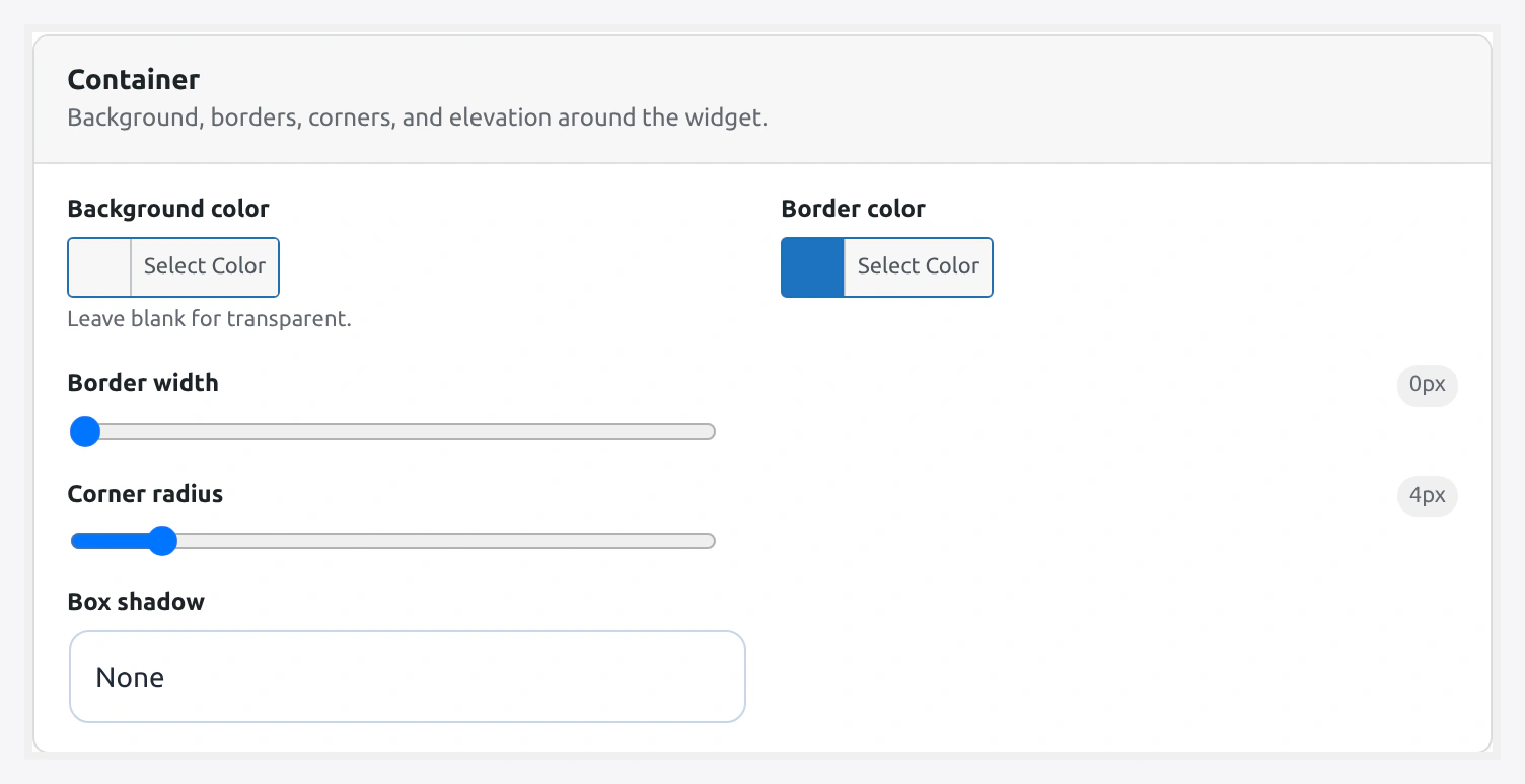
Container section — background, border, radius, shadow:
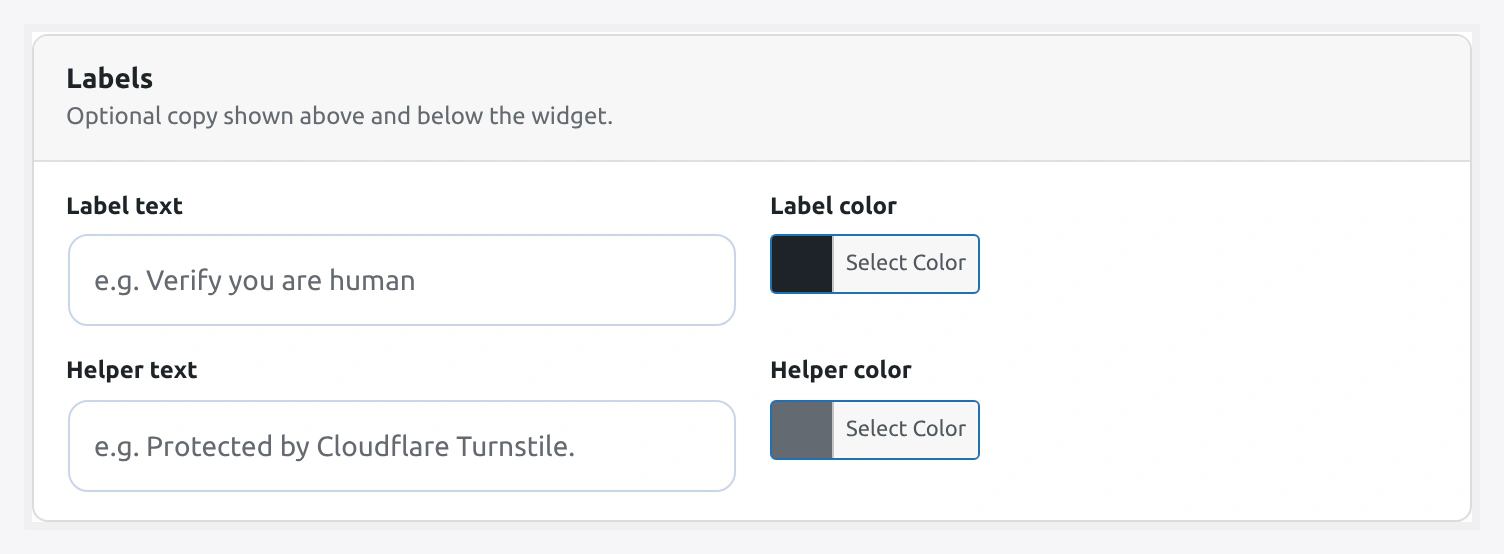
Labels section — optional label + helper text with color pickers:
Live visual editor for the widget. Change colors, borders, shadows, and labels with a real Cloudflare Turnstile widget rendered in front of you.
URL: wp-admin/admin.php?page=wkcft-settings&tab=wkcft_design_studio
Option key: wkcft_design_studio (single array option)
Live preview requires valid Site Key
The preview uses your saved Site Key. If the preview shows "Invalid sitekey", save a valid key on the API Settings tab first.
Sections
1. Cloudflare Options
Passed directly to the Cloudflare widget as data attributes.
Theme
Pick light, dark, or auto. An empty select leaves the General Settings theme in place.
| Option | Preview |
|---|---|
| (empty — use General) | Whatever is set on General tab |
auto | Follow visitor's system preference |
light | Light background |
dark | Dark background |
Size
Widget dimensions.
| Option | Pixel Size | Use Case |
|---|---|---|
normal | 300 × 65 | Default — most forms have room |
compact | 130 × 120 | Sidebars, tight columns |
flexible | 100% container width | Responsive layouts |
Language
Localizes widget text (the tiny "Verifying..." / "Success" text).
Supported:
| Code | Language |
|---|---|
auto | Match browser Accept-Language header |
en | English |
fr | French |
de | German |
es | Spanish |
it | Italian |
pt | Portuguese |
ja | Japanese |
zh | Chinese (Simplified) |
ar | Arabic |
ru | Russian |
hi | Hindi |
2. Layout
Wraps the widget in a styled container.
Alignment
- Option:
alignment - Values:
left·center·right - Default:
left
CSS flex alignment of the widget inside its parent container.
Margin Top
- Option:
margin_top - Range: 0 - 100 px
- Default: 0
Space above the widget.
Margin Bottom
- Option:
margin_bot - Range: 0 - 100 px
- Default: 0
Space below the widget.
Padding
- Option:
padding - Range: 0 - 40 px
- Default: 0
Inner padding between the container edge and the widget.
3. Container
The box behind/around the widget.
Background Color
- Option:
bg_color - Type: Hex color picker
- Default: empty (transparent)
Leave empty for transparent, or pick a color to create a solid box.
Border Color
- Option:
border_color - Type: Hex color picker
- Default: empty (no border)
Border Width
- Option:
border_w - Range: 0 - 8 px
- Default: 0
Border Radius
- Option:
border_rad - Range: 0 - 32 px
- Default: 0
Round the container corners.
Shadow
- Option:
shadow - Values:
none·subtle·medium·strong - Default:
none
| Option | CSS box-shadow |
|---|---|
none | none |
subtle | 0 1px 3px rgba(0,0,0,0.08) |
medium | 0 4px 12px rgba(0,0,0,0.12) |
strong | 0 8px 24px rgba(0,0,0,0.16) |
4. Labels
Optional text around the widget.
Label Text
- Option:
label_text - Type: Text (max 120 chars)
- Default: empty
- Position: Above the widget
Example uses:
Please verify you are humanSecurity checkProtected by Cloudflare
Label Color
- Option:
label_color - Type: Hex color picker
- Default:
#1d2327
Helper Text
- Option:
helper_text - Type: Text (max 200 chars)
- Default: empty
- Position: Below the widget
Good for tiny reassurance copy:
Your data stays privateNo solving puzzles requiredCheckout is end-to-end protected
Helper Color
- Option:
helper_color - Type: Hex color picker
- Default:
#646970
Live Preview
On the right side of the tab, a real Cloudflare Turnstile widget renders with your current settings. As you change any field, the preview updates in real time.
- Preview background — uses your current page background so you see real contrast
- Reset to defaults button — undoes unsaved changes and restores shipped defaults
- Color picker uses the WordPress built-in color picker
Reset to Defaults
A single button clears every field on this tab. Useful if you experimented and want to start over.
Reset is local
Reset only clears the Design Studio tab. API keys, form toggles, conditional rules, and per-form overrides are not touched.
Where These Settings Apply
Every enabled form uses the Design Studio styling — except when:
- A form has an override on Per-Form Config — the per-form values win
- A shortcode passes explicit attributes — the shortcode values win
- The checkout Blocks widget — uses Design Studio styles via a localized config
Complete Field Reference
| Field | Array Key | Type | Default | Range/Values |
|---|---|---|---|---|
| Theme | theme | select | empty | `` · auto · light · dark |
| Size | size | select | normal | normal · compact · flexible |
| Language | language | select | auto | See language table |
| Alignment | alignment | select | left | left · center · right |
| Margin Top | margin_top | number | 0 | 0 - 100 px |
| Margin Bottom | margin_bot | number | 0 | 0 - 100 px |
| Padding | padding | number | 0 | 0 - 40 px |
| Background Color | bg_color | hex color | empty | any hex |
| Border Color | border_color | hex color | empty | any hex |
| Border Width | border_w | number | 0 | 0 - 8 px |
| Border Radius | border_rad | number | 0 | 0 - 32 px |
| Shadow | shadow | select | none | none · subtle · medium · strong |
| Label Text | label_text | text | empty | max 120 chars |
| Label Color | label_color | hex color | #1d2327 | any hex |
| Helper Text | helper_text | text | empty | max 200 chars |
| Helper Color | helper_color | hex color | #646970 | any hex |
Recipes
"Trust Seal" Look
Show that the form is protected — good for checkout.
- Label Text:
🔒 Secure checkout protected by Cloudflare - Label Color:
#008a20(green) - Background:
#f0fdf4 - Border Color:
#22c55e - Border Width:
1 - Border Radius:
8 - Shadow:
subtle - Padding:
12
Minimal, Blends With Theme
Invisible container, just the widget.
- All colors / borders / shadow empty or 0
- Size:
normal - Alignment:
left
Sidebar Widget
Tight column like a sign-up box.
- Size:
compact - Alignment:
center - Padding:
8 - Background:
#ffffff - Border Color:
#e5e7eb - Border Width:
1 - Border Radius:
4
Dark Mode Matching
If your site has a dark theme.
- Theme:
dark - Background: empty (transparent — the widget's own dark box shows)
- Label Color:
#f5f5f5 - Helper Color:
#a1a1aa
Related Pages
- General Settings — Global theme / appearance / load mode
- Per-Form Config — Override styles per form
- Shortcode — Per-instance overrides via
[wkcft-turnstile]