General Settings
All of the module's global settings live in one place: Restaurant POS → Settings → Kitchen & Customer Screen. Settings that belong to a single outlet, such as the wording and artwork on the dining room display, live on the outlet instead — see Customer Screen Setup.
Select Save Configuration at the bottom of the tab to store any change.
Firebase Details
Eight fields that connect the module to your Firebase Realtime Database. They are only used when Select App Access Type is set to Firebase. Filling them in is covered step by step on the Real Time Connection page.
Slider settings
Three blocks control the three sliders on the customer screen. They share the same four fields.
| Setting | Description | Default |
|---|---|---|
| Slide Effect | The transition between slides | Slide |
| Slide Direction | Left to Right, or Right to Left | Left to Right |
| Slide Delay | How long each slide is held, in milliseconds. Minimum 500 | 2000 |
| Slide Speed | How long the transition itself takes, in milliseconds. Minimum 500 | 1500 |
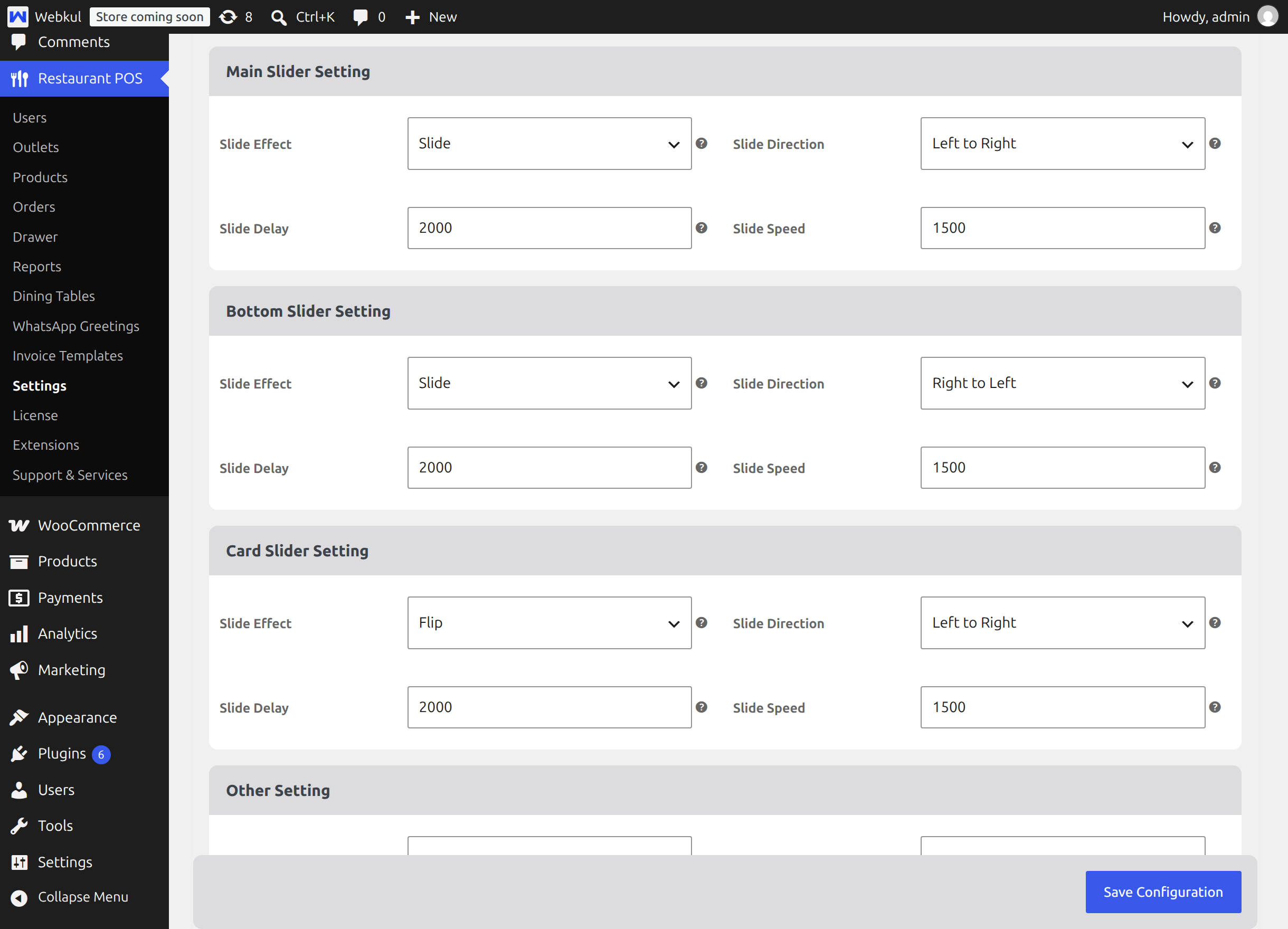
Which block controls which slider
| Block | Controls | Shown when |
|---|---|---|
| Main Slider Setting | The large slideshow that fills the customer screen | The outlet has slideshow images and video is off |
| Card Slider Setting | The small card slider beside the video | The outlet has video enabled |
| Bottom Slider Setting | The strip of small images along the bottom | Always |
Available effects are Slide, Cover Flow, Cards, Fade, Cube, Flip and Creative. The bottom slider is deliberately limited to Slide and Cover Flow, because it shows several images at once and the three dimensional effects do not read well at that size. Its default direction is Right to Left, and the card slider defaults to the Flip effect.
Tips
Long delays suit a menu board that people read; short delays suit promotional artwork. A delay of 2000 with a speed of 1500 means each slide is visible for two seconds and takes a second and a half to change, which is a comfortable starting point.
Other Setting
| Setting | Description | Default |
|---|---|---|
| Video Control | Show the play, pause and volume controls on the customer screen video | Disabled |
| Select App Access Type | The live channel, Firebase or Socket | Firebase |
Leave Video Control disabled for an unattended wall display: the video then plays silently on a loop with no controls for a passer by to press. Enable it only if a member of staff needs to pause the video.
Kitchen Screen Web APP Settings
These four fields describe the kitchen display when it is installed as an app on a tablet or a till computer.
| Setting | Description | Default |
|---|---|---|
| Name | The full application name | Kitchen Screen |
| Short Name | The name shown under the icon on a home screen | Kitchen |
| Theme Color | The colour of the system bars while the app is open | #a333c8 |
| Background Color | The colour behind the icon while the app starts | #a333c8 |
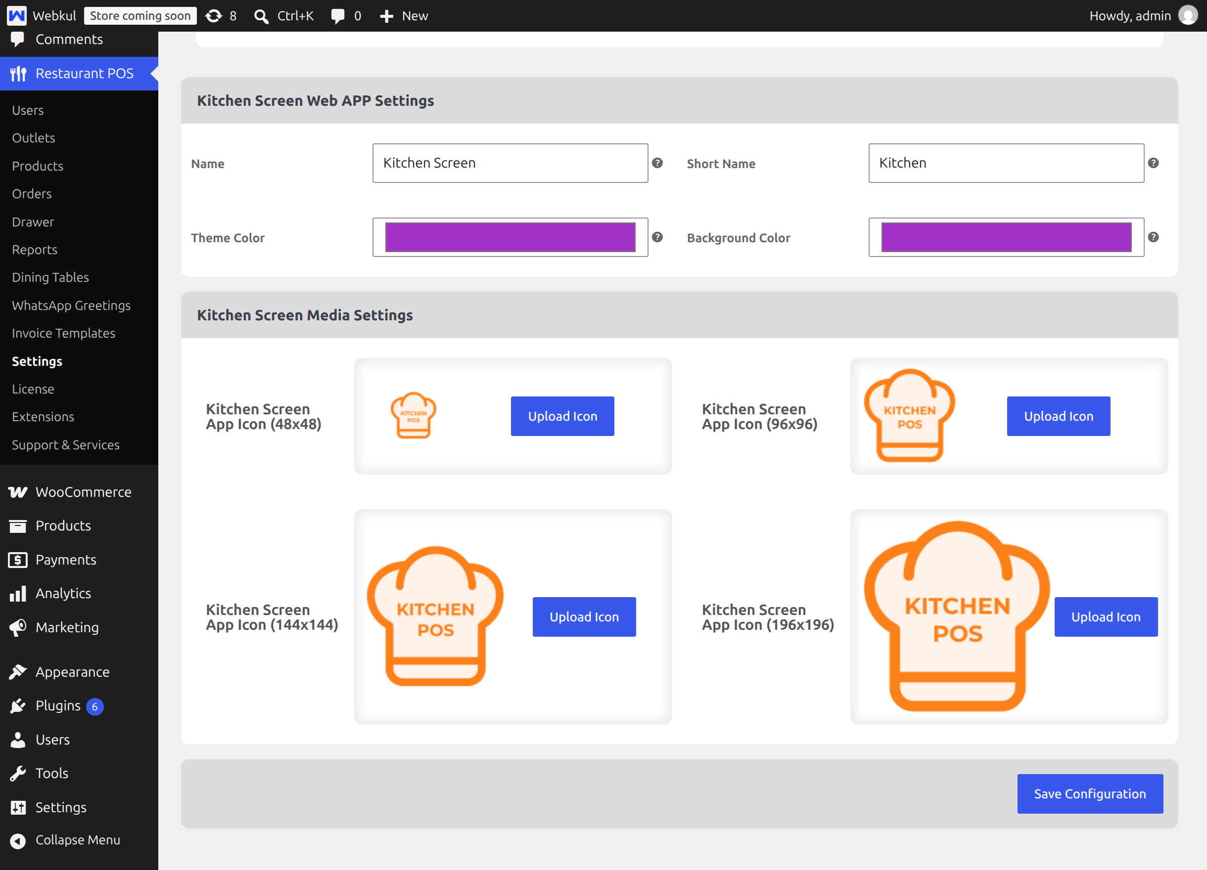
The installed app always opens the kitchen address full screen in landscape, which is what a wall mounted display needs.
Kitchen Screen Media Settings
Four icon slots — 48, 96, 144 and 196 pixels square — used when the kitchen display is installed as an app. Each has an Upload Icon button that opens the WordPress media library. If you leave a slot alone, the module's own orange chef hat icon is used at that size.
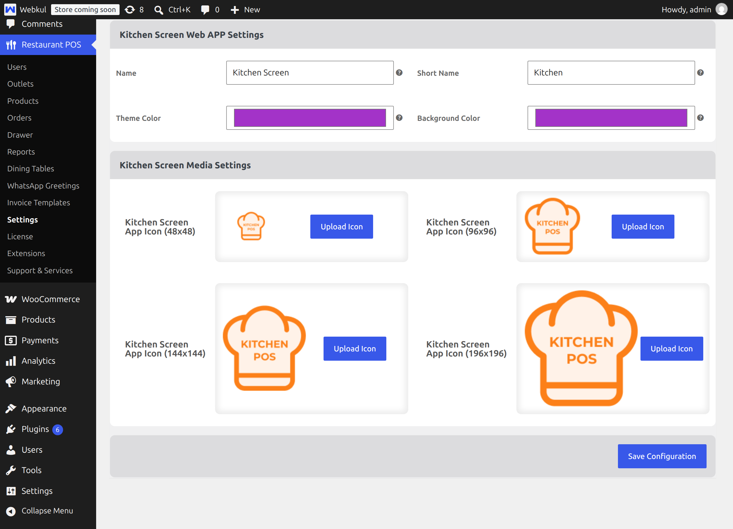
Upload a square image at each size for the sharpest result. A single large square image will also work, because the browser scales it.
Important
The app files that carry these names, colours and icons are written when the plugin is activated. If you change them here and a tablet still shows the old name or icon, deactivate and reactivate the plugin to republish the files, then reinstall the app on the tablet.
Branding the screens
Neither the kitchen display nor the customer screen has its own logo or colour fields. Both take their livery from the Point of Sale, so the till, the board on the pass and the display in the dining room stay in one look without being styled three times.
Colours
Open Restaurant POS → Settings → Appearance. Set the three fields under POS Theme Colors by hand, or choose one of the ready made Color Schemes, which fills all three for you. Reset to Default puts the module's orange and green back.
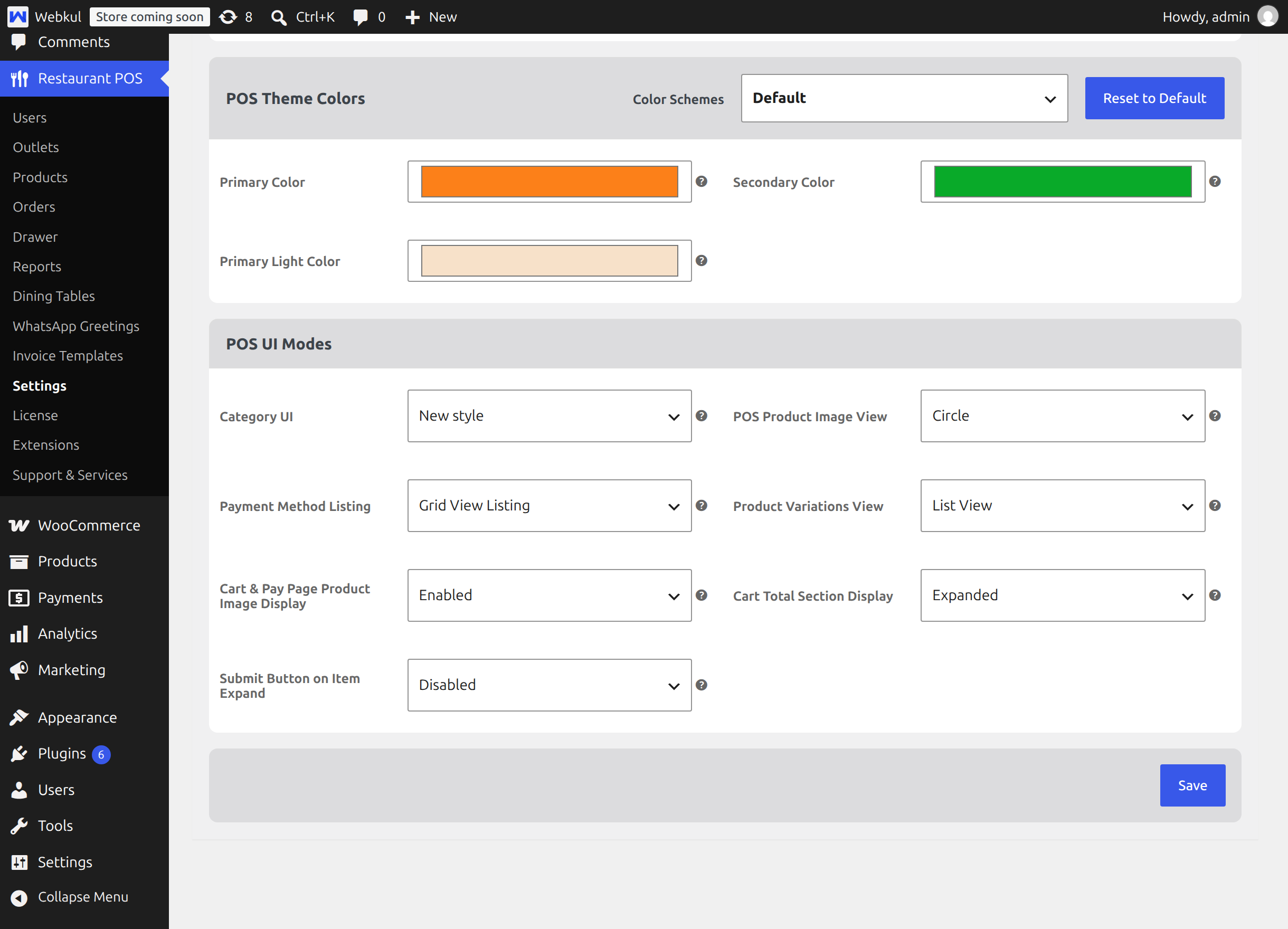
| Field | Where it shows on the kitchen and customer screens |
|---|---|
| Primary Color | The filled Start button on an On Hold card, card outlines, the On Hold heading on the POS tabs, and the highlighted tab and menu icons on the customer screen |
| Secondary Color | The Completed heading and its count badge, and the outlined Send button on a completed card |
| Primary Light Color | The tint behind the selected tab on the customer screen |
Save the tab, then reload the kitchen address and the customer screen. The new colours are picked up on the next load — nothing has to be republished.
Two colours are deliberately fixed and will not follow this tab: the blue used throughout Preparing, and the red on the On Hold column heading of the standalone board. They stay constant so the three stages of a ticket always read the same way, whatever livery you choose.
Logo
The header of both screens shows your store name as text until you turn the logo on.
- Open Restaurant POS → Settings → General.
- Upload your logo in the invoice logo field.
- Set Enable POS Logo to POS screen header to Enabled.
- Save, then reload the kitchen address.
If you enable the option without uploading a logo, the screens fall back to the Point of Sale's own placeholder icon rather than your store name, so upload the image first.
Note
The POS Theme Mode choice at the top of the Appearance tab — OS Default, Light or Dark — applies to the Point of Sale only. The kitchen display and the customer screen each carry their own moon button and remember that choice per device, so a wall mounted board can run dark while the till stays light.
Next step
Continue with Endpoints and URLs.